KINZ KANAAN
Branding & graphic design
ABOUT THE COMPANY:
Kinz means ‘treasure’ in Arabic, while Kanaan originates from the ancient land of Canaan – a region historically renowned for its superior craftsmanship and artistic expression and the root of Maysoun Kanaan’s Palestinian heritage.
ROLE:
Graphic Designer & SoMe content Consultant
Date:
May 2021 – present
01
Visual Identity
INSPIRATION
COLORS
PRIMARY COLORS
Kinz Kanaan wants to represent as a high end classical design with an ethic touch which is rooted in Arabic ancient culture. I choose this bright brown color, matching with a matte black and white.
#915C1D
#212121
#F5F5F0
SECONDARY COLORS (color bank)
Using my research into ancient Arabic and Moroccan culture, as well as ancient mosques and temples, I provided them with a color bank for use for future collections or social media.
#14A3A1
#BF6F84
#021E73
#1B3A2D
TYPOGRAPHY
THIS IS AN EXAMPLE OF A HEADER.
Font name: Trajan Pro 3 Regular
THIS IS AN EXAMPLE OF A SUB-HEADER
Font name: Futura PT Book
This in an example of the body text.
Font name: Futura PT Light
NEW TYPEFACE

Font name: Trajan Pro 3 Light
02
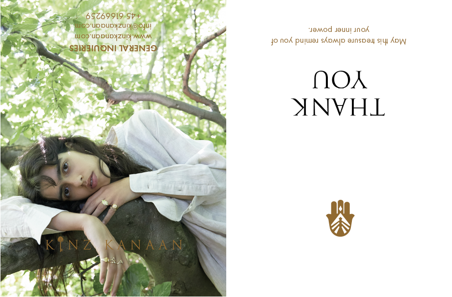
Graphics & Print

03